Joopi Case Study
OVERVIEW
Joopi emphasizes community-focused features for Asian(Korean) Americans, group events, and cultural activities that help users connect over shared interests and values. This not only helps in finding a partner but also in building a network of like-minded individuals.
Skills & Tools Used
- 🎨 Prototyping
- 💻 Figma
- 📝 Notion
- 🔍 User Research
- 📊 Competitive Analysis
- 📋 Storyboarding
- ✏️ Wireframing
Design Process
The design process involved conducting extensive user research and testing to guide design decisions, ensuring that the app's features aligned with user needs and preferences. By gathering feedback through user interviews and usability testing, the team iterated on designs to improve the overall user experience.
Roles and responsibilities
I led the UX/UI design for Joopi, an Asian American dating app, managing research through implementation. I conducted competitor and SWOT analyses, researched user pain points, and designed culturally-relevant profile screens with step-by-step onboarding. I created solutions for gender imbalance, match quality, and safety concerns using Figma for prototyping and Notion for documentation, delivering designs that prioritized community and cultural connection.
Korean Popular Dating Apps 🇰🇷
- Noondate 정오의 데이트: Focused on serious relationships
- Amanda 아만다: Women-focused
- Boo: Focus on personality compatibility in finding meaningful connections
- MEEFF: Cultural adaptability and tailored features in Korea
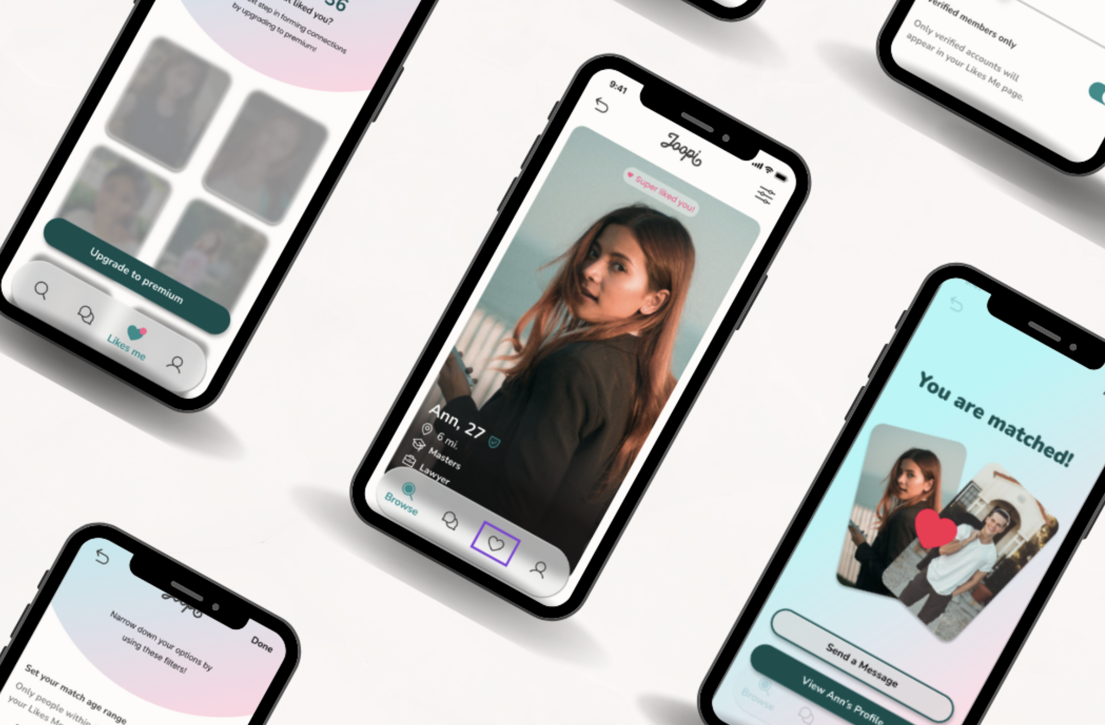
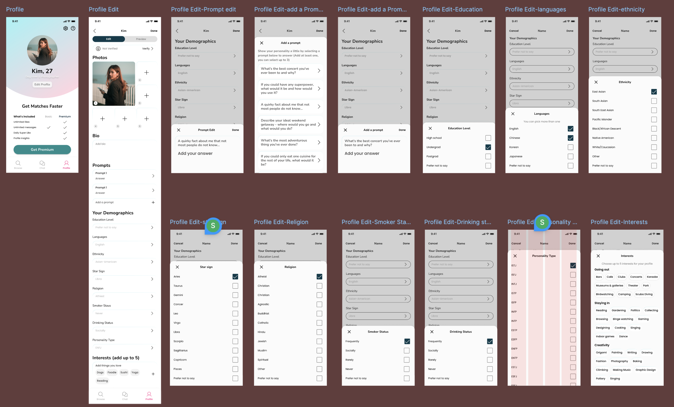
TASK 1: Initial task focussed on profile screens - March to April
This project showcases a comprehensive user profile system I designed for a mobile application. The screens demonstrate a thoughtful approach to gathering and displaying user information, with a focus on creating an intuitive and engaging user experience.
The design includes various sections for users to input their personal details, preferences, and interests. Key features of the profile system include:
- Customizable photo gallery
- Demographic information input (education, languages, ethnicity)
- Interactive prompts to encourage user engagement
- Detailed preference selectors (star sign, religion, personality type)
- Lifestyle indicators (smoking and drinking status)
- Interest selection with a wide range of options
The UI maintains a clean, modern aesthetic with a consistent color scheme and layout across all screens. The step-by-step approach to profile completion allows users to easily navigate through different sections, making the process of creating a detailed profile less overwhelming.
COMPETITIVE ANALYSIS 📊
For the competitive analysis, I examined the websites and apps of several direct and indirect competitors, focusing on popular dating platforms as well as social networking apps with dating functionalities. I also explored trends in online dating, particularly the increasing demand for more personalized matches and enhanced safety features. The analysis aimed to uncover design strategies that effectively address common user pain points during the matchmaking and onboarding process, while identifying areas where competitors fall short in meeting user needs, such as better filtering options and improving user trust. Additionally, I created provisional personas based on the competitors' likely target audience. This helped establish a foundation for understanding who the ideal personas for our dating app would be. With these insights, I then moved on to conducting user interviews to dive deeper into specific needs and preferences.
Direct Competitors
The direct competitors such as TanTan, 2RedBeans, and Lovevite are dating apps that target a specific demographic—Asian singles, offering various features to enhance the user experience for this group. The direct competition revealed strategies like a strong focus on user profiles, easy swiping mechanisms, and tailored search filters. However, there were areas for improvement, such as limited user engagement features and relatively basic interaction designs.
Indirect Competitors
On the other hand, indirect competitors like Bumble, Tagged, and Badoo serve a broader dating audience but share similar functionalities. These apps highlight global trends in dating, such as the rising popularity of gamification, location-based matching, and community-oriented events. Their strengths include user-friendly interfaces, well-executed brand identity, and innovative features like Bumble's women-first approach and Badoo's integrated social networking aspects.
SWOT ANALYSIS 📊
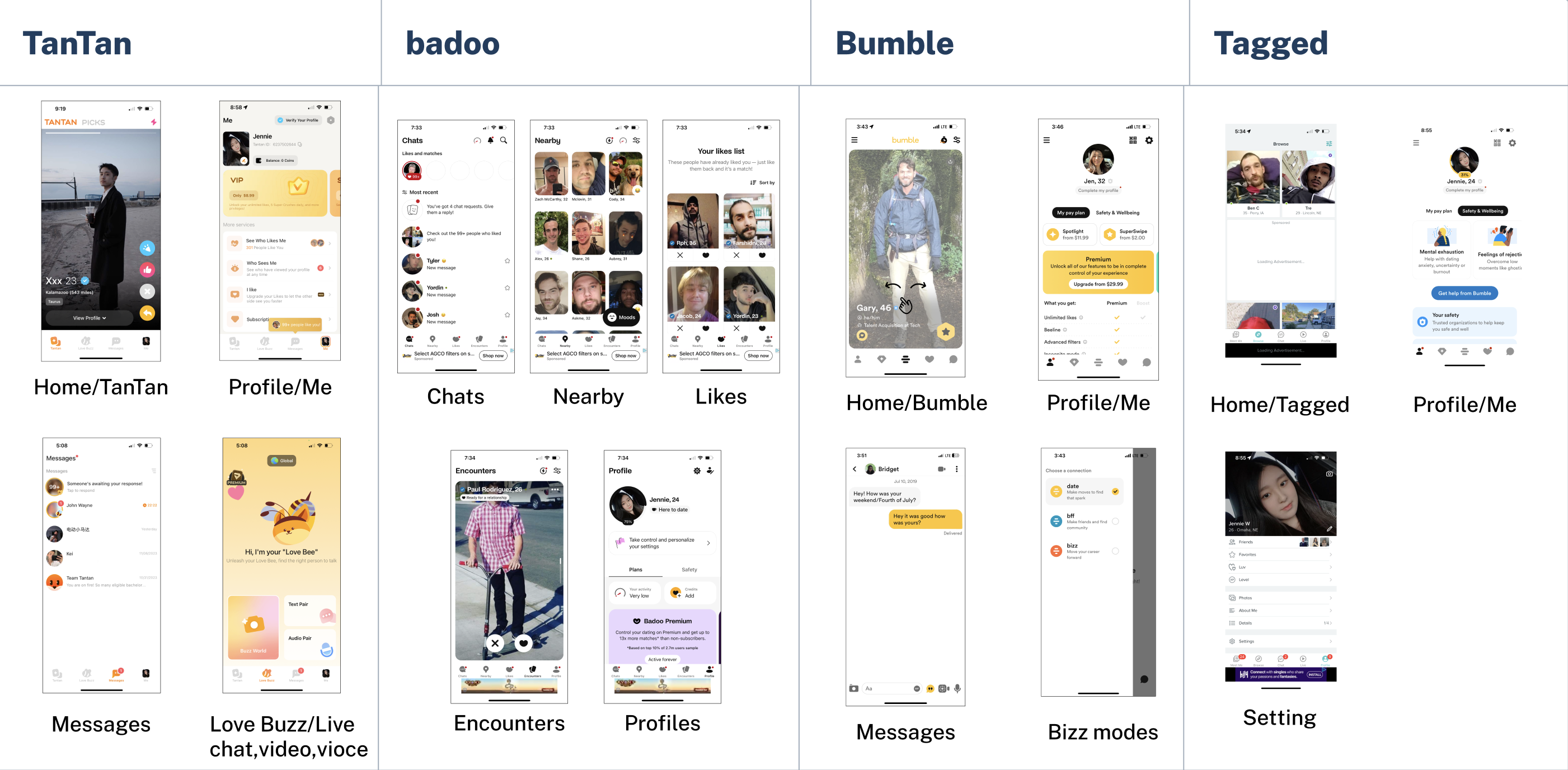
The screenshots display interfaces from four dating apps—TanTan, Badoo, Bumble, and Tagged—highlighting various sections such as home screens, profiles, messages, and additional features. Each app offers distinct user experiences: TanTan emphasizes communication with live chat and video options, Badoo focuses on social discovery through features like nearby users and "Encounters," Bumble stands out with its female-first messaging approach and versatile Bizz modes for dating, friendships, and professional networking, while Tagged blends social networking with dating, allowing for more profile customization and community interaction. The designs vary in complexity, with Bumble and Badoo offering more streamlined, feature-rich interfaces, while Tagged and TanTan maintain simpler, communication-focused layouts.
| Company | Mission statement | Target market | Pricing /month | Strengths | Weaknesses |
|---|---|---|---|---|---|
|
TanTan
|
"Discover people nearby and meet your #BaeGoals" | Mostly Asian men and women between 25 to 34 |
Free to download but three tiers:
|
|
|
|
Badoo
|
"With tech that can't be matched, we want to make it easier to find someone who gets your heart beating faster." | People aged between 25-34 and 35-44, average around 25 |
Free to download, with two premium tiers:
|
|
|
|
Bumble
|
Meet, chat, and date new people | Young people between 18-34 |
Free to download with premium options:
|
|
|
|
Tagged
|
"We keep it real. You can do you and be accepted for who you are." | Young people 18+ |
Free to download with Tagged Premium packages:
|
|
|
User Review and Feedback Analysis
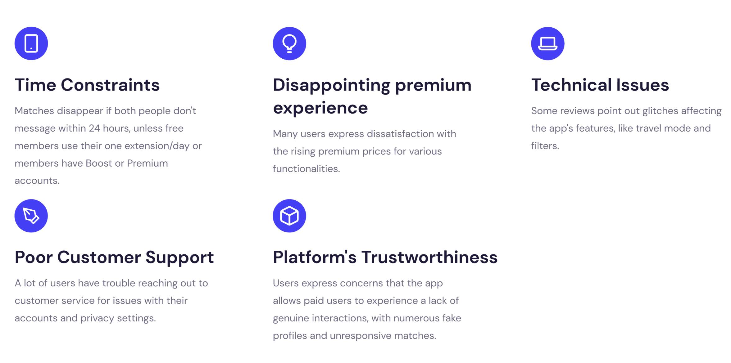
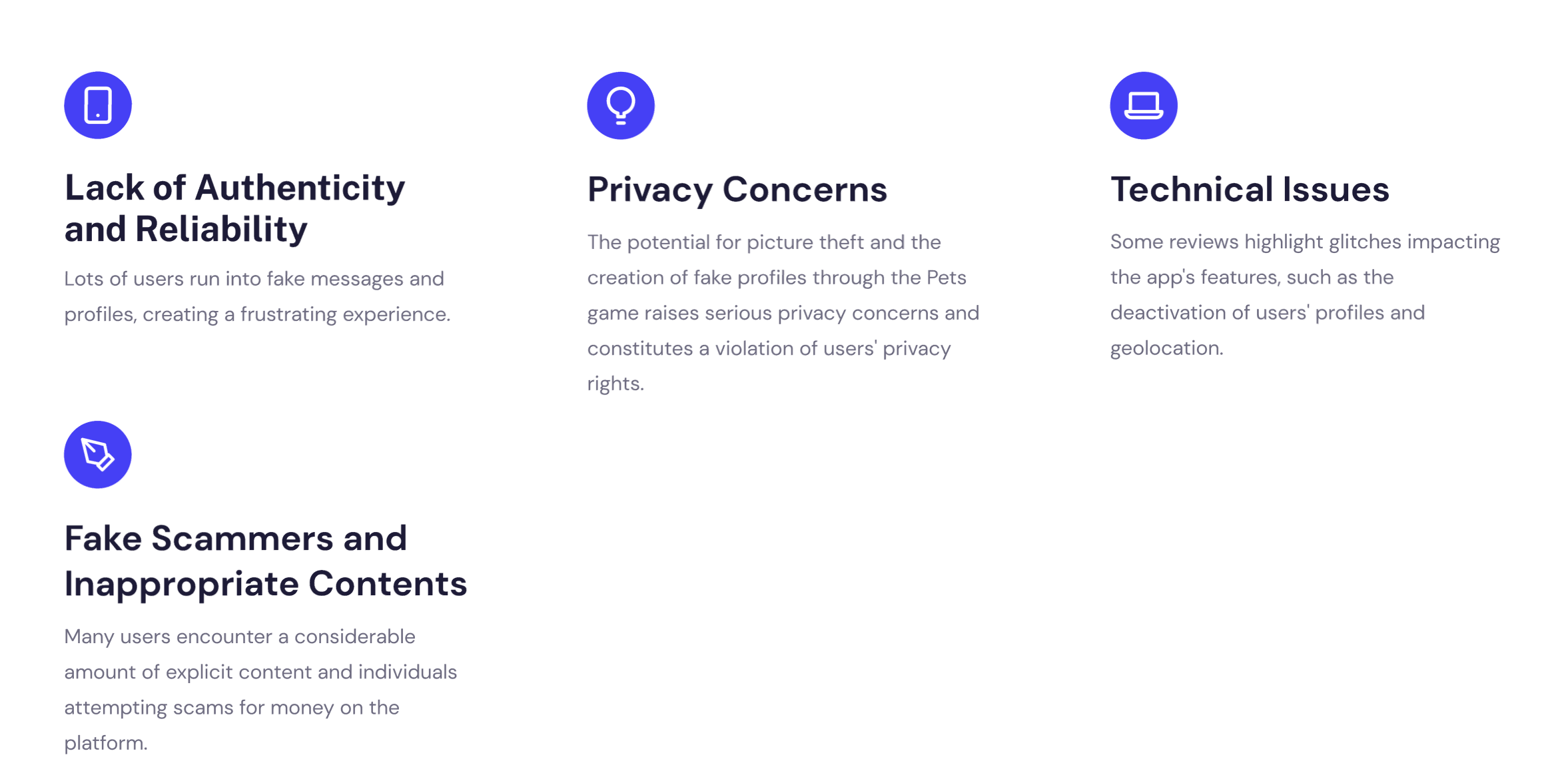
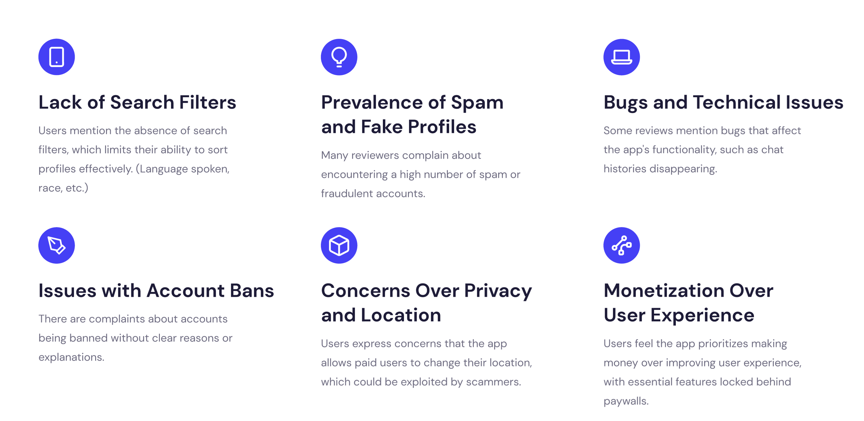
I conducted an in-depth user review analysis on popular dating apps—Badoo, Bumble, Tantan, and Tagged. I systematically categorized the feedback to highlight areas of strength, such as user interface design and ease of use, as well as areas that need improvement, like filtering options, performance, and user safety features. This comprehensive review allowed me to present actionable insights that can guide potential enhancements and optimize the overall user experience for these platforms.
Badoo
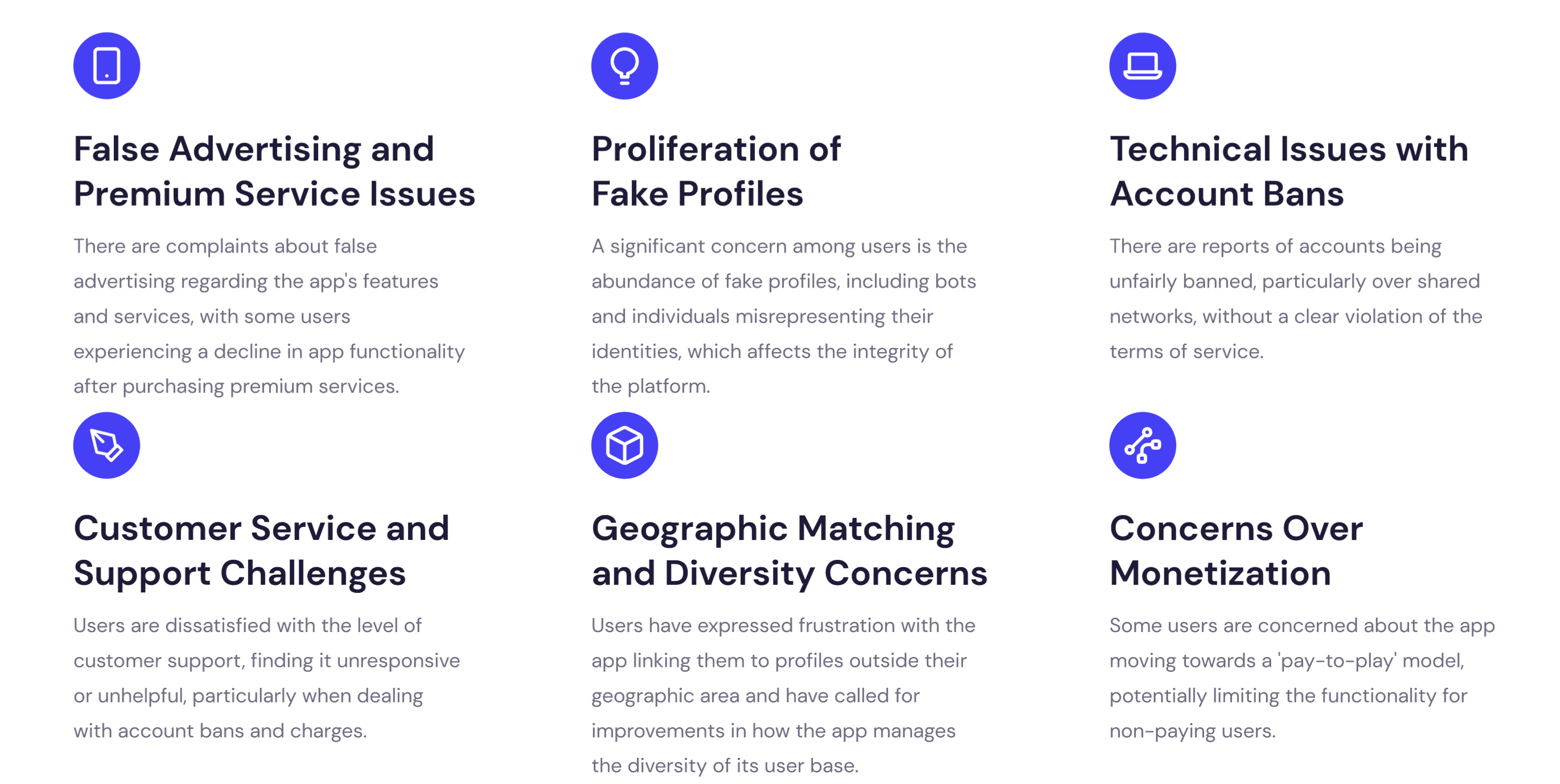
Bumble
Tagged
TanTan
TASK 2: Pain point analysis and feature ideation - April to May
PAIN POINTS
A comprehensive breakdown of the major issues affecting our dating app, including demographic imbalances, match quality concerns, safety issues, cost barriers, usability challenges, and social stigma.
Imbalance Demographic
More Male than Female Users.
Male users have lower match rate and success rate.
Potential Solutions:
- Targeted marketing to attract more female users
- Partnerships with female-centric platforms
- Address gender inclusivity by expanding gender options
Poor User Match Quality
- Frustration with match quality
- Misleading profile photos
- Dishonesty in personal details
- Deceptive intentions
- Ghosting, choice paradox
Potential Solutions:
- Enhance profile credibility with professional information
- Improve algorithms
- Provide detailed user profiles
Safety Issues
- Catfishing, harassment, physical safety concerns
- Higher harassment rates among women
- Fake profiles and romance scams
Potential Solutions:
- Opt-in background checks
- Methods for identifying fake profiles
- Real-name registration or selfie verification
Subscription Cost
Cost of premium features can be a barrier.
Potential Solutions:
Provide value for money and allow testing of full capabilities before committing to premium features.
In-app Navigation and Usability
Sign-up process is time-consuming.
Potential Solutions:
Streamline the sign-up process and improve Facebook integration.
Stereotypes Associated with Online Dating
Stigma associated with using dating apps.
Potential Solutions:
Better branding and marketing messages to combat the stigma and encourage a positive perception.
Key Pain Point Metrics
of female users report safety concerns
Male to female user ratio
of users abandon sign-up process
Feature Ideation
Based on our pain point analysis, we've developed the following feature ideas to address user concerns:
Enhanced Verification System
Multi-level verification including photo, ID, and social media to reduce fake profiles
Community Events
Group meetups and cultural activities to attract more female users
Progressive Onboarding
Step-by-step profile completion that allows users to start matching immediately
Premium Trial Weekends
Weekend access to premium features to demonstrate value before subscription
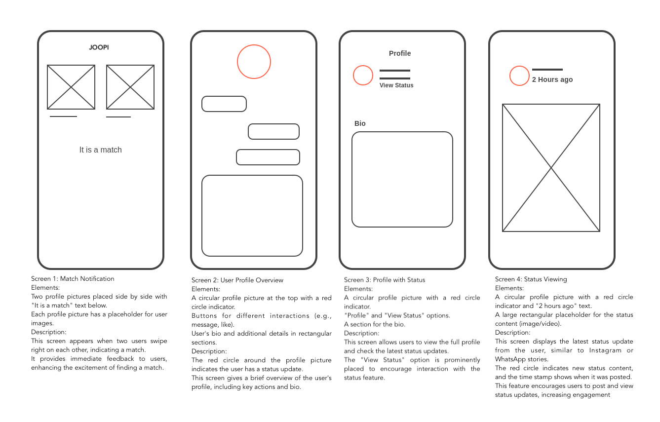
WIREFRAMING
Based on one of the pain points like how to attract more female users. This wireframe description outlines how the dating app integrates a status feature to enhance user engagement and attract more users by providing familiar social media functionalities within the dating context.
Key aspects include the ability to share photos and short videos as status updates. Privacy controls ensure that users can see each other's status only after a match, providing a sense of security. Interactive elements, such as reactions and quick replies, foster engagement. This feature allows users to showcase their personality and hobbies in a fun way beyond profile photos, helping to build trust and a sense of community.
CONCLUSION
If the Joopi app intends to attract Asian Americans seeking long-term, serious relationships, it must navigate a competitive landscape dominated by established platforms known for fostering meaningful connections. To differentiate itself, Joopi should prioritize quality over quantity, leveraging innovative matching algorithms and effective engagement strategies that resonate with users in search of genuine, committed partnerships.